 0o酱
0o酱CSS: 更有质感的描边效果
CSS: 更有质感的描边效果
在刷推的时候发现了很有质感的 CSS 样式,想要实现一下。
效果预览
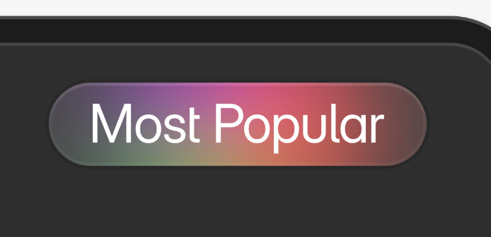
参考效果

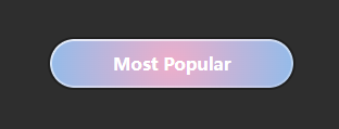
实现效果
实现思路
分析原图
通过观察,可以发现原图是一个拥有两层描边的圆角矩形
最外层是一个较暗于背景颜色的描边,内层是一个由上至下线性渐变的描边,颜色从不透明度较高的白色渐变至半透明的白色
内部为渐变背景
效果实现
主要的难点在实现多重描边和渐变颜色的描边
多重描边
CSS outline 属性可以在已有的描边基础上再添加一层描边,因此可以通过 outline 属性实现多重描边
div {
  border: 6px solid blue; /* 描边 */
  outline: 6px solid red; /* 描边外层 */
}
border: 6px solid blue;
outline: 6px solid red;
渐变描边
渐变描边可以通过 :before 伪类 实现
div {
    position: relative;
    background: #fff;
    background-clip: padding-box; /* 背景只填充内容区域 */
    border: 6px solid transparent; /* 透明描边 */
}

div::before {
  content: '';
  position: absolute;
  z-index: -1;
  top: 0; left: 0; right: 0; bottom: 0;
  margin: -6px; /* 描边厚度 */
  border-radius: inherit; /* 继承父元素的圆角 */
  background: linear-gradient(to bottom, red, blue); /* 渐变颜色 */
}
效果
最终效果
源码
<html>
  <body style="
      background-color: #2e2e2e;
  ">
    <div class="test" style="">Most Popular</div>
  </body>
  <style>
    .test {
      width: clamp(100px,50%,200px);
      padding: 10px;
      text-align: center;
      font-weight: bold;
      color: white;
      border-radius: calc( 1px * 1000000 );
      position: relative;
      background-clip: padding-box;
      border: solid 2px transparent;
      background: radial-gradient(circle, rgba(238,174,202,1) 0%, rgba(148,187,233,1) 100%);
      background-clip: padding-box;
    }
    .test:before {
        content: " ";
        position: absolute;
        z-index: -1;
        left: 0; top: 0; right: 0; bottom: 0;
        margin: -2px;
        border-radius: inherit;
        background: linear-gradient(170deg, rgba(255, 255, 255, 0.75) 0%, rgba(255, 255, 255, 0.2) 100%), radial-gradient(circle, rgba(238, 174, 202, 1) 0%, rgba(148, 187, 233, 1) 100%);
        outline: solid 2px #00000050;
    }
</style>
</html>
评论
评论加载中…